Counting incidents is easy. Interpreting the count is where almost everyone goes wrong, including people who write headlines about it for a living.
Our 2026 statistics page keeps a running tally of every incident we have recorded this year, updated continuously. It is genuinely useful, and it is also the single easiest number on this site to misread. This is a guide to reading a year of incident data properly — what the shape of a year actually looks like, which patterns are real, and which are artefacts of how the data was collected rather than facts about the world.
The first rule: these are detections, not occurrences
Everything else follows from this one.
Our counter does not measure how many incidents happened. It measures how many incidents were detected and recorded by our monitoring. Those two numbers are related, but they are not the same number, and the gap between them moves for reasons that have nothing to do with events in the world.
Three things move it:
- Sources being added. When we add a national newspaper feed or extend the local-language sweep to more countries, the count rises the next day. Nothing happened in the world; we simply started looking somewhere new.
- Detection thresholds. Seismic networks report earthquakes down to around magnitude 2.5 — quakes most people would never feel. A year with more recorded earthquakes is usually a year with better instrumentation or a swarm of tiny tremors near a dense sensor array, not a more violent planet.
- Media attention. Most incident categories — building collapses, road and rail accidents, fires, blasts — have no official feed anywhere in the world, so they enter the record only when a journalist writes about them. A busy news week produces a busy chart.
So the honest reading of any year-on-year rise is: we recorded more. Whether more happened is a separate question that this dataset, on its own, cannot answer.
The three rhythms that repeat every year
With that caveat carried properly, some patterns are real, and they recur reliably enough to be worth knowing.
1. Seismic activity dominates the raw count — and shouldn't dominate your attention
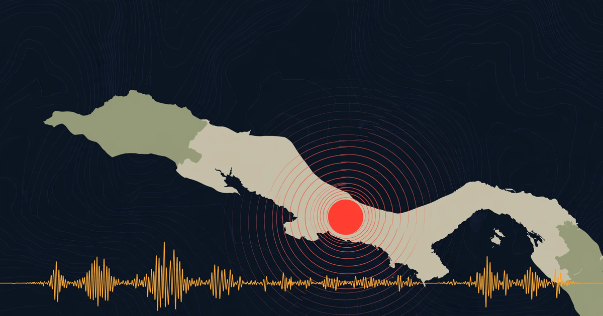
The Earth does not rest. Once you are counting from magnitude 2.5 upward, earthquakes will out-number every other incident type in almost any period you choose, simply because the seismic networks are the most complete detection system humanity has built for anything.
This makes the raw type breakdown misleading if read as a ranking of danger. A hundred small tremors and one building collapse are not comparable quantities. When you look at the type index, read within a type across time rather than across types at a single moment.
2. Floods are the sharpest seasonal signal
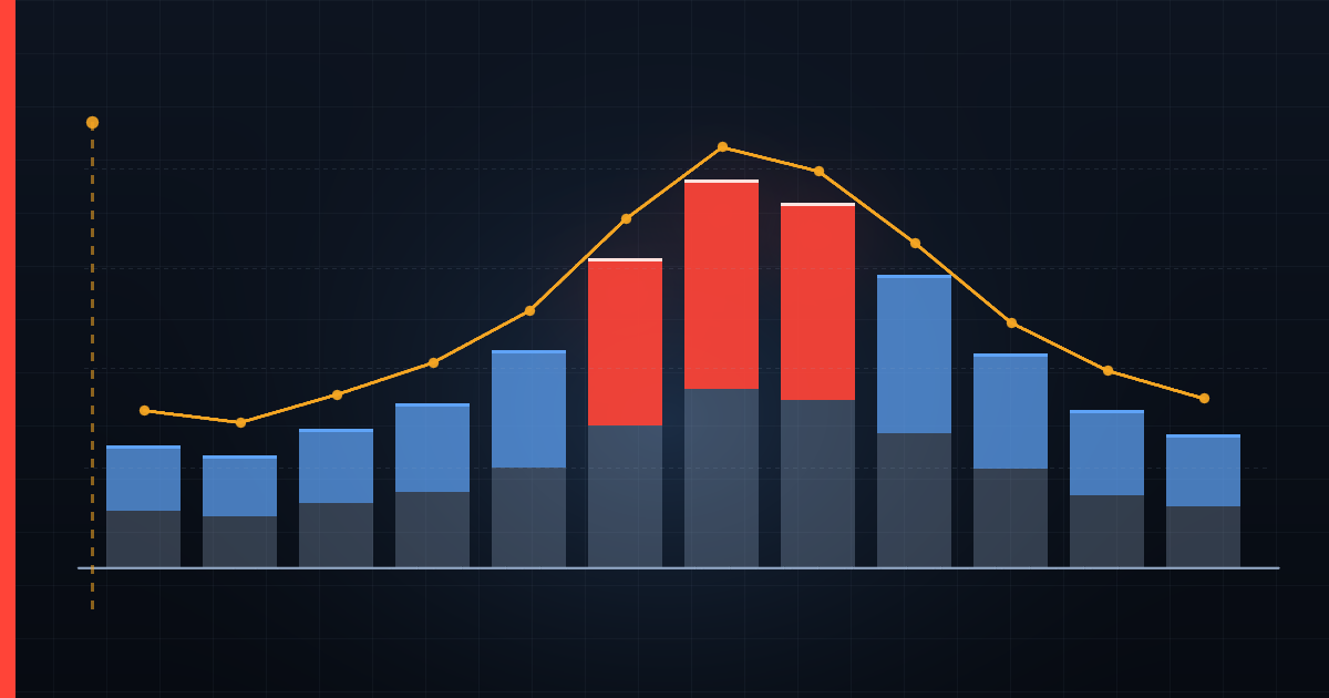
Flooding is the pattern most visible in the calendar. The South Asian monsoon drives a pronounced mid-year concentration across Pakistan, India and Bangladesh. The Atlantic hurricane season runs roughly June to November and pushes flood and storm counts across the Caribbean and the American south. East Asia's typhoon season overlaps with it. In each case the spike is regional and seasonal, and it is not evidence of a worsening year until you have compared it with the same weeks of previous years.
That comparison is exactly what the country comparison tool is for, and the on this day archive shows what the same calendar date has held historically. If your region is entering its flood season, our guide to why shallow water kills is the more useful page than any counter.
3. Wildfire counts track heat, with a lag
Wildfire detections follow heat and dryness closely — which means they follow heatwaves, usually with a delay of days to weeks. When the heatwave feed gets busy in a region, the wildfire feed tends to follow. This is one of the few places where two of our types are visibly causally linked, and it is worth watching if you are in an affected area — both for the fire risk and because heat itself is the deadlier half of the pair, which is why we wrote a separate guide on recognising heatstroke.
A caution specific to fire: our satellite detection clusters thermal hotspots and only records genuinely large fires, so a small but locally serious fire may not appear at all unless a news source reports it.
The comparison trap: press density looks like risk
The most tempting thing to do with a year of global data is rank countries by it. It is also the most misleading, and the reason is uncomfortable.
Because most incident types reach us only through journalism, a country with a dense, free, well-funded local press will appear to have more incidents than a country where the same events happen and go unreported. Two neighbouring countries with identical real risk can produce very different counts purely because one has more newsrooms filing more stories.
The effect is strongest exactly where it matters most — for building collapses, road accidents, fires and industrial incidents, the categories with no official feed anywhere. It is weakest for earthquakes, which are measured by instruments that do not care how many newspapers a country has.
So a country league table built from this data is closer to a map of media coverage than a map of danger. What the data can support is comparing one country against its own history: is this monsoon season heavier than the last three for the same weeks? That question the archive answers honestly, and it is the one the comparison tool is built for.
What a quiet week means
Nothing.
This is worth stating plainly because the psychology runs the other way. A sparse map feels like reassurance and a crowded one feels like an emergency, and neither feeling is informative. A quiet week on the map can mean a genuinely quiet week, or a holiday period with thin news coverage, or a feed that has been failing quietly — which is precisely why we publish live source health on the status page rather than hiding it.
A crowded week is not cause for panic either. The world does not become more dangerous because a dataset got more complete.
Four rules for reading the year page
- Compare like with like. Same weeks, same country, same incident type. A cross-type or cross-country comparison mostly measures reporting density, not risk.
- Check the start date. Continuous monitoring began when this site did. Every counter carries a note saying when — a year total is a total of what we recorded, not a world total, and it never was.
- Read source counts on individual incidents. A record confirmed by several independent sources is a stronger record than one carried by a single outlet. That number is on every incident page.
- Treat early casualty figures as provisional. We publish them only where an official source states them, and in the first hours after any major event they are routinely wrong in both directions — sometimes badly.
What the year genuinely tells you
Used carefully, a year of this data answers a narrower but more useful set of questions than "was this a bad year".
It shows you when your region's risk concentrates — which months carry the flooding, when the fire season really starts, whether cold-wave incidents in your country cluster in January or February. It shows you what kind of incident dominates where you live, which is rarely what national conversation suggests. And on the country pages and city index, it shows you the local texture — the wall collapses and the road accidents that never reach a national bulletin but make up most of what actually happens to people.
That is the honest use of a live incident archive: not a scoreboard of how bad the year was, but a way of seeing the shape of ordinary risk in a specific place, so that preparation happens before the season rather than during it. If that is what you are here for, the emergency kit checklist and free local alerts are the two things worth doing today.
The full archive is downloadable as CSV and queryable as JSON on the data page, with the licence and citation format. If you use it, please carry the detection caveat above into whatever you publish — the numbers are only honest with it attached.